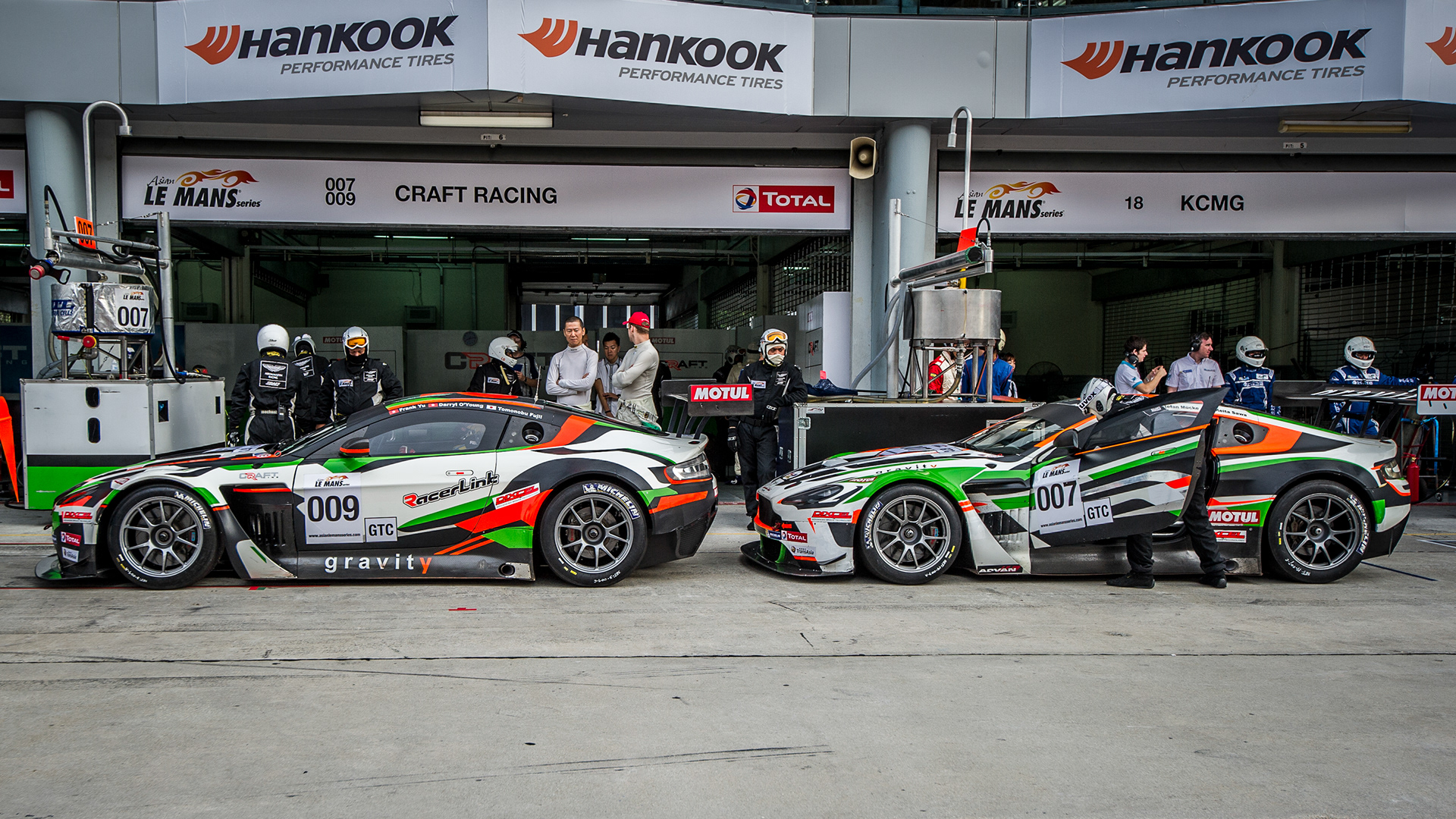
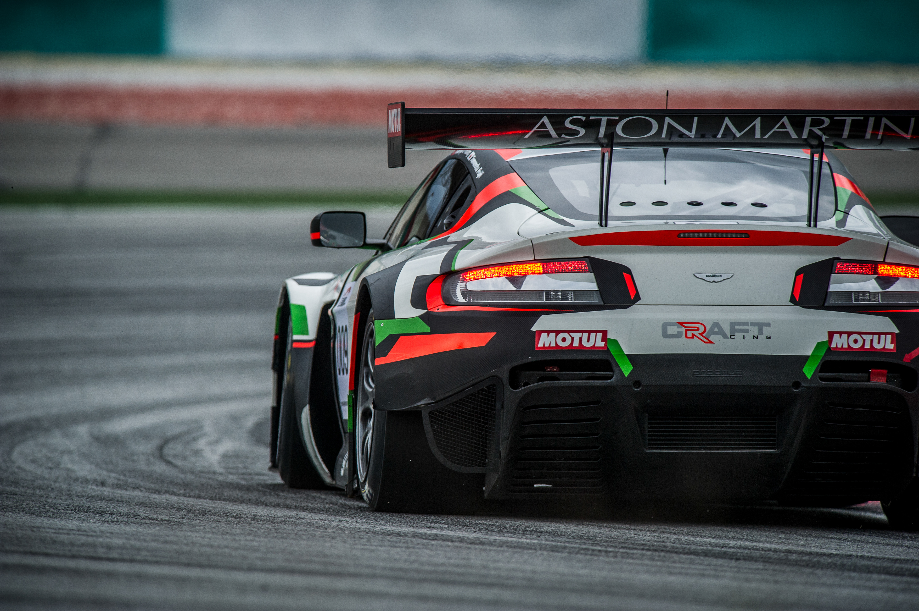
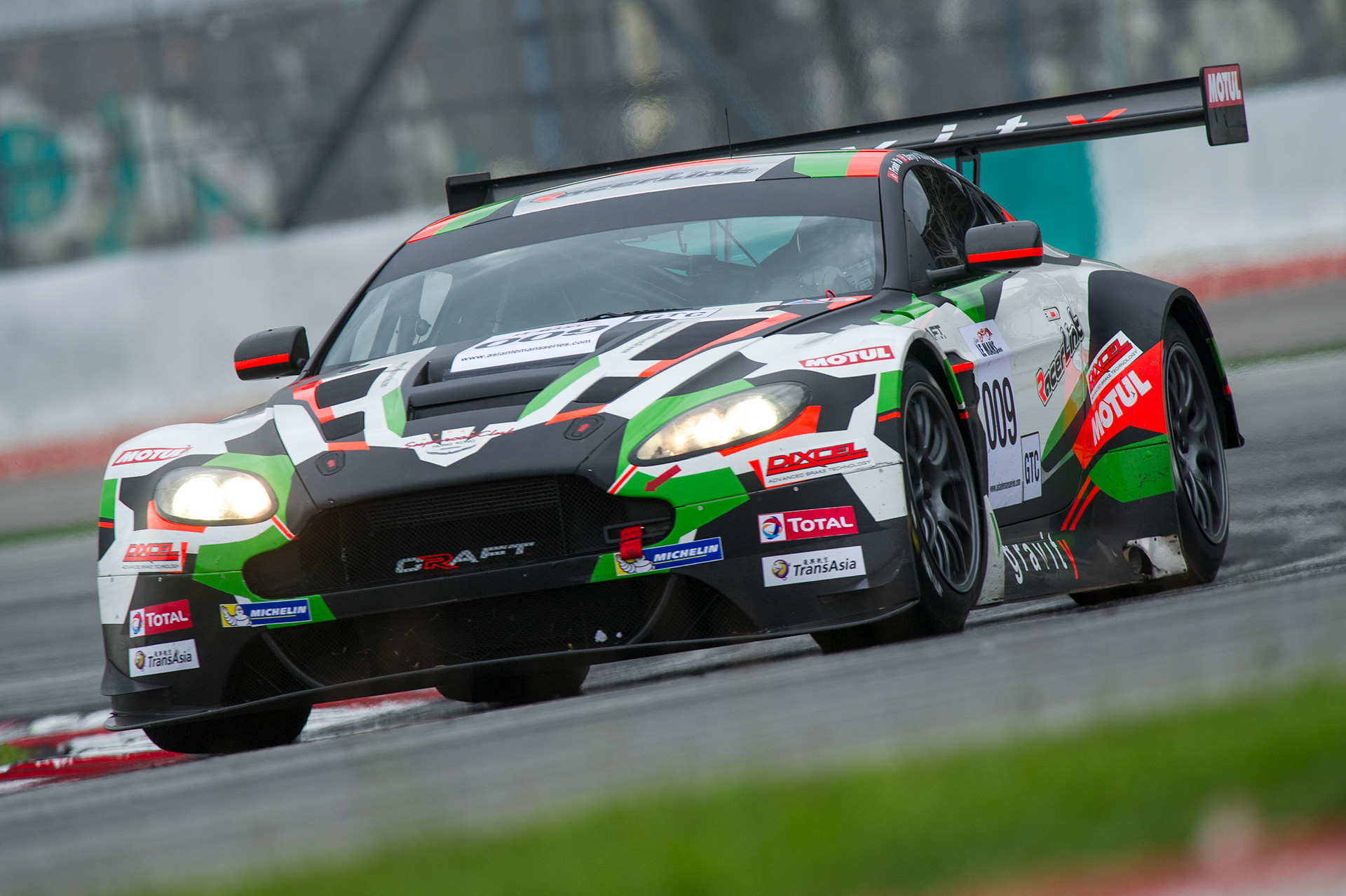
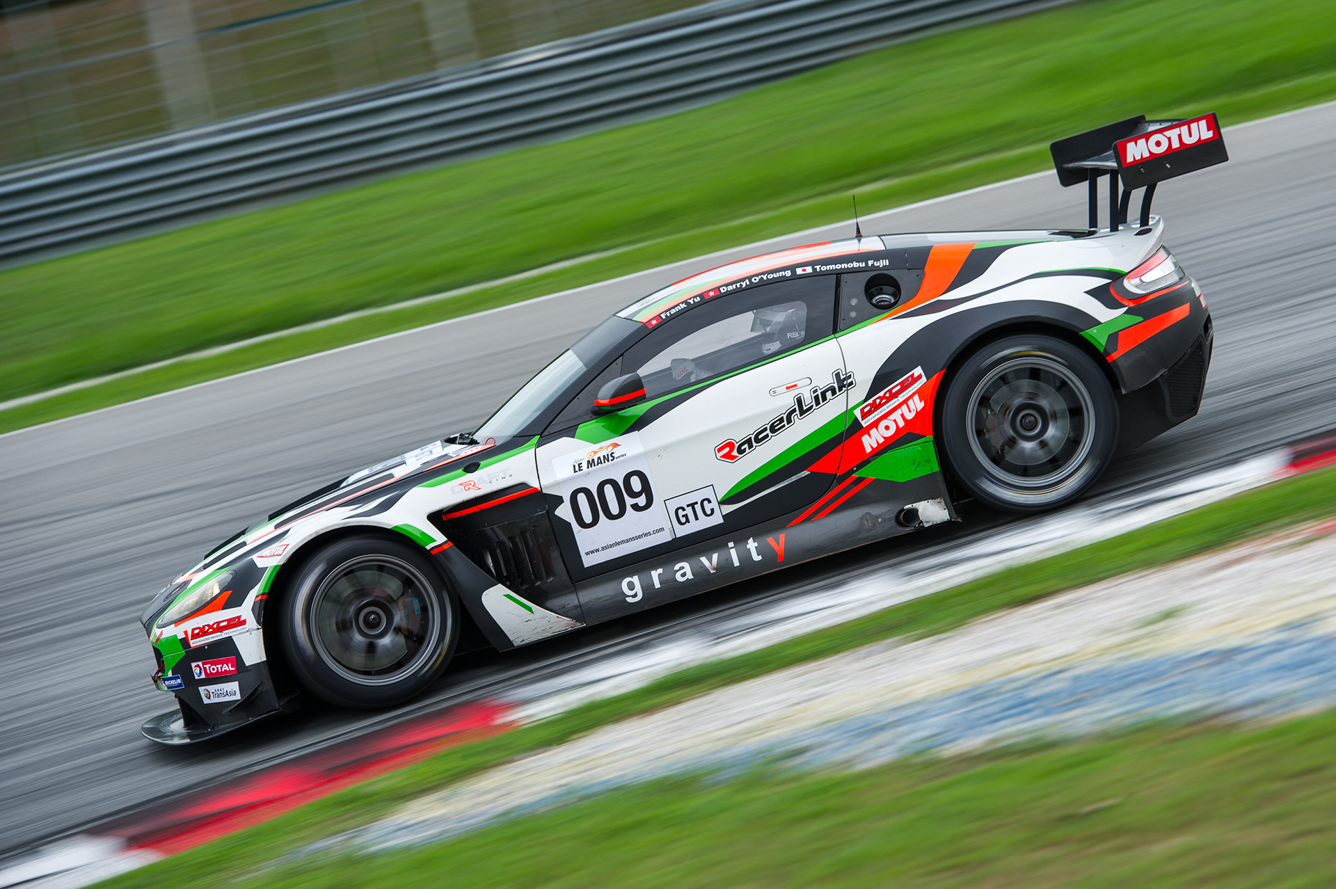
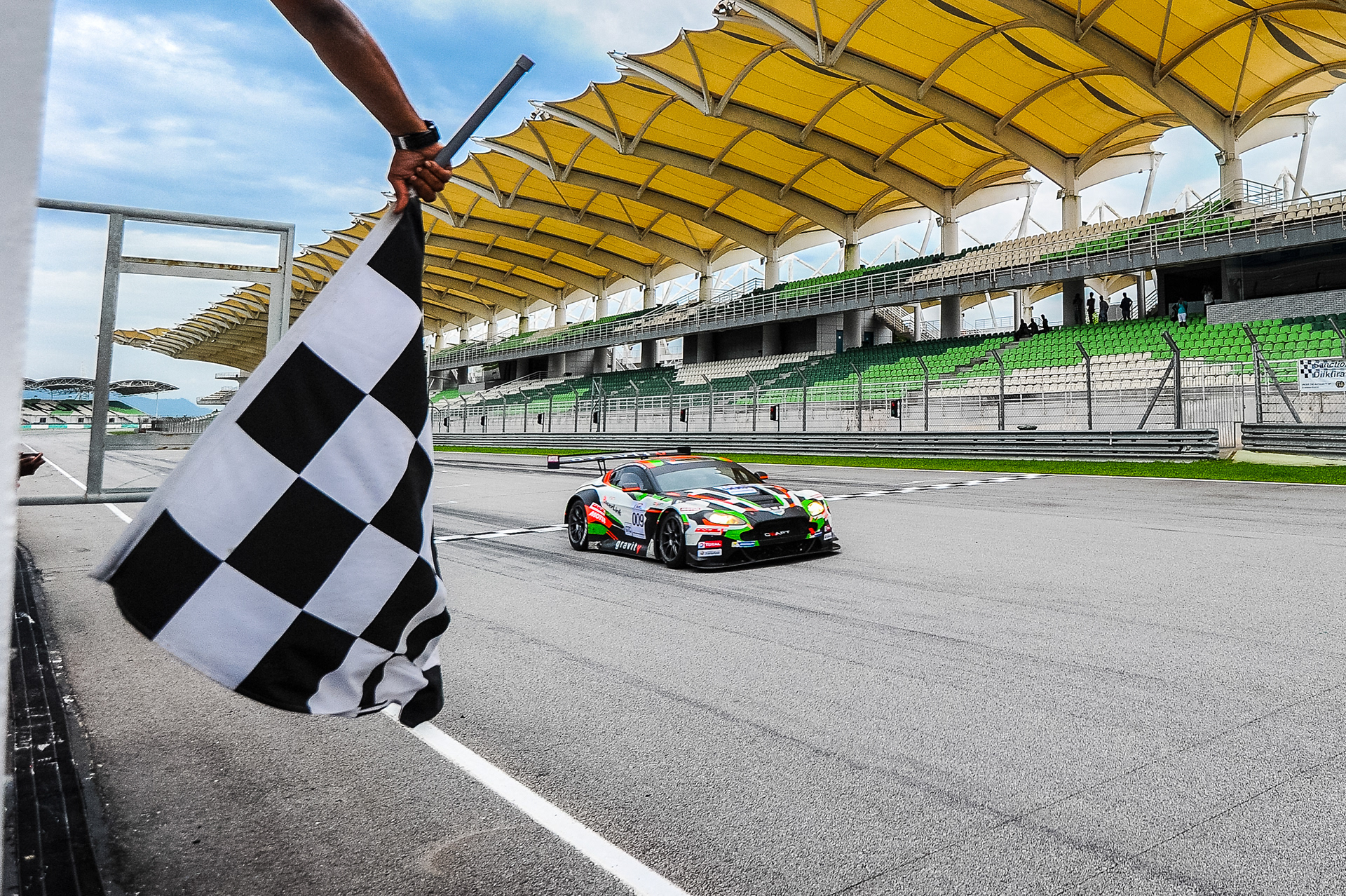
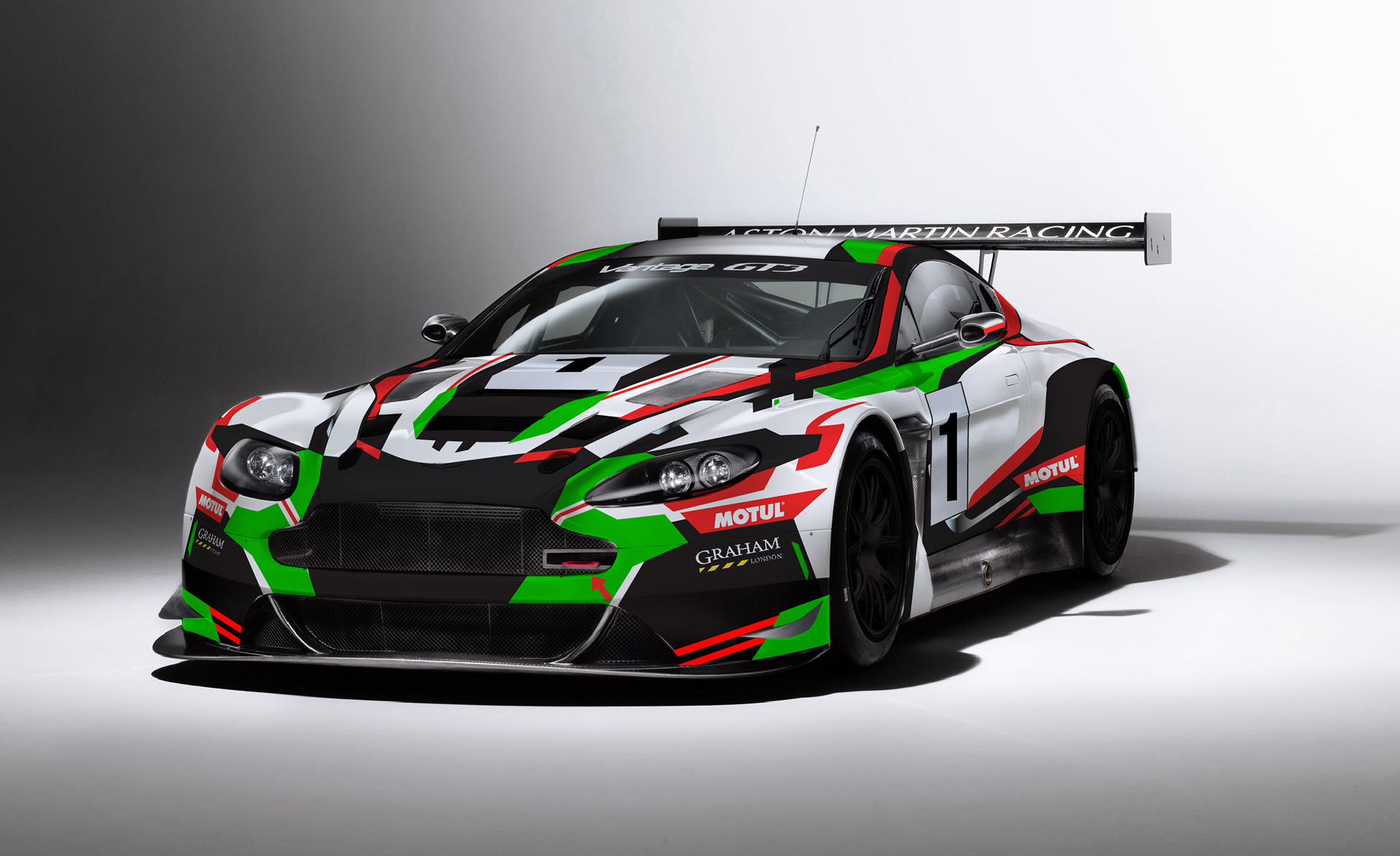
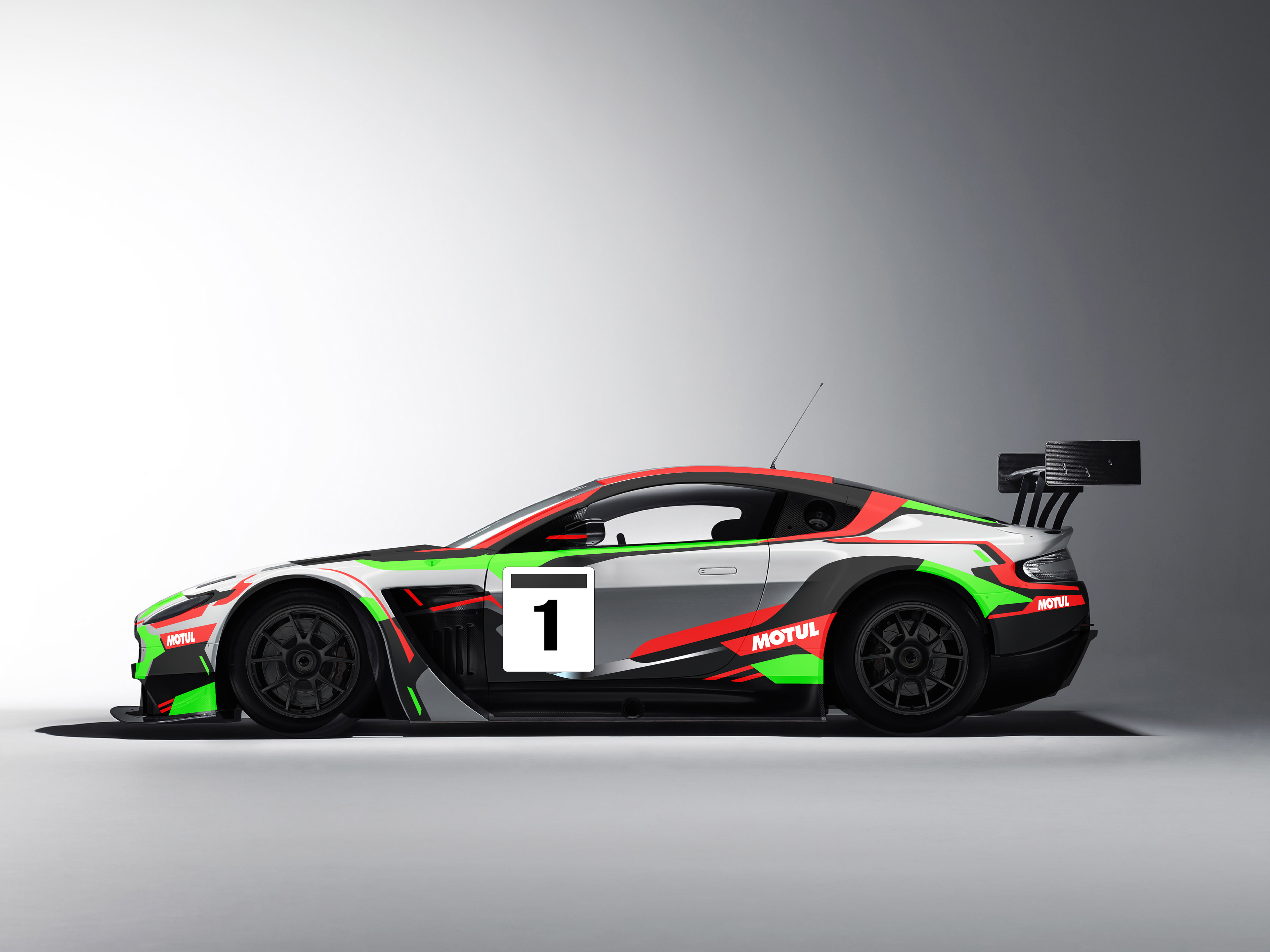
DESIGN
The main design direction taken for the new car is a flowing horizontal waist line, and a bias towards more areas of black, to differentiate it with the old car, which was predominently white.
A black snout is created for a more menacing presence while selective areas see simplification in design in favour of being more logo friendly.
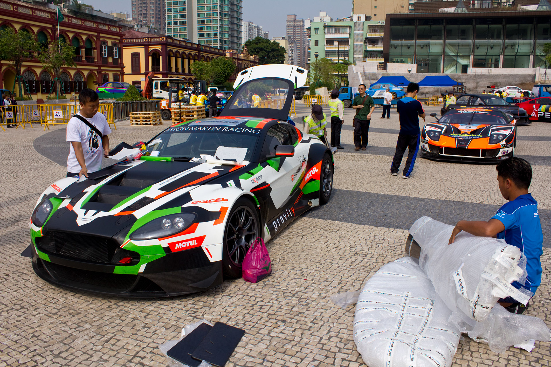
PRODUCTION
While the old car graphic was completely laid by hand, some of the curves on the new car were created with the aid of vector graphics and automated viynl cutters. The process took two days, which completion some minor adjustments were considered nesscary and was laid down by hand on site.

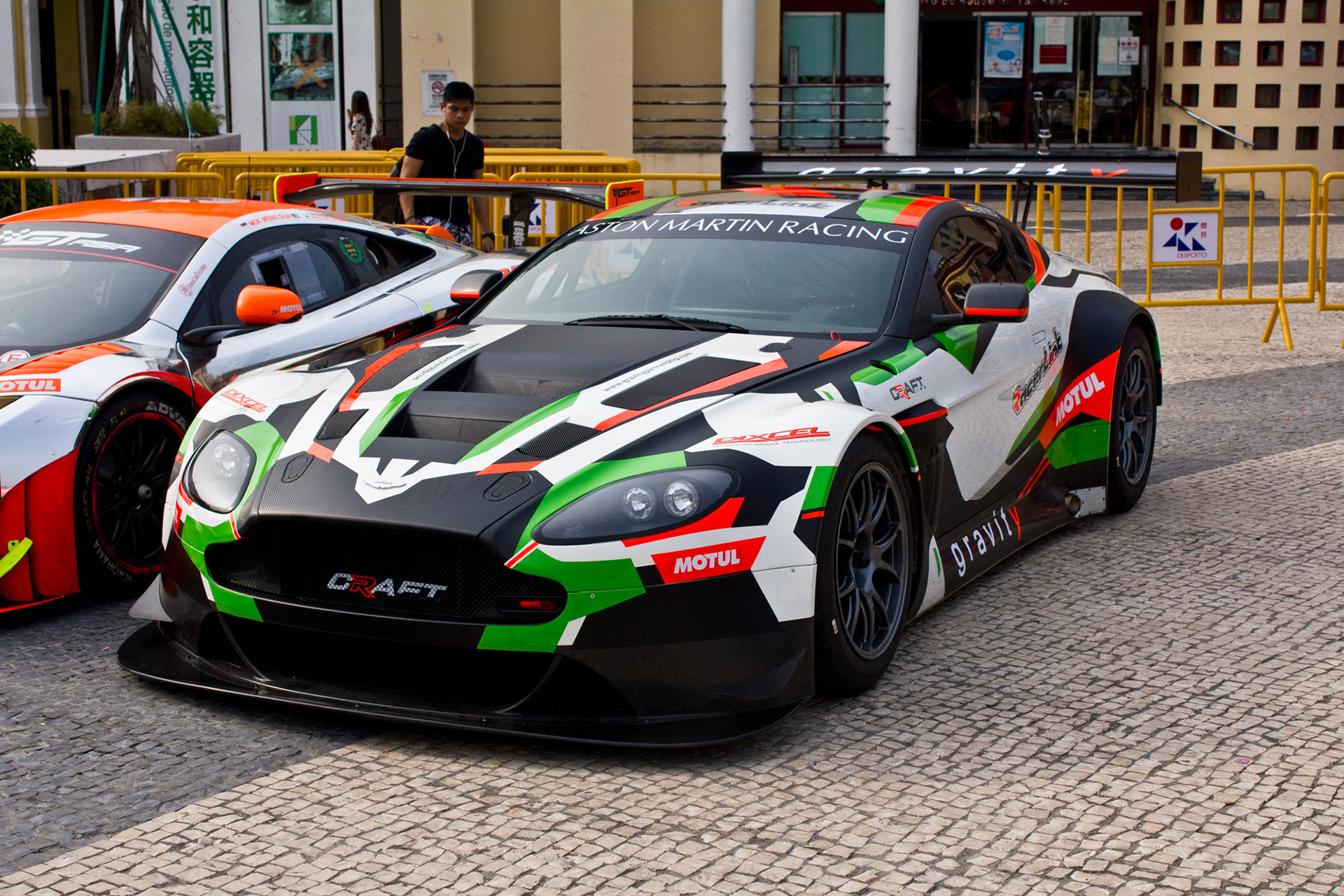
The original intent was to run this livery for the 2014 season, but as the team matured into a more global outfit, a more neutral and sponsor friendly identity was decided to replace this interim solution.