
MOSCOW RACEWAY BRAND EXTENSION
The brief was to expand on the basic items already developed by the branding team of Moscow Raceway Management, and develop a full branding guideline, merchandise range and printed materials in time for the 2013 WTCC and Renault World Series race. Moscow Raceway provided a lot of support in terms of overcoming the language barrier and has given a lot of creative freedom in the process.
We benchmarked a lot of the top tier circuit branding in the asian region, such as Bahrain International Circuit, and decided upon a direct and vibrant language in terms of promoting Moscow Raceway, it is to be a B-class circuit catering to both International events such as DTM, as well as an approachable budding ground for the still very new local motorsport scene.

Brand guideline was first designed in English then translated into Russian, the average word length of the Russian language poses a challenge on the layout and hence an ultra-wide aspect ratio format was chosen,
it is also at this stage that we first learned the basics in Russian language structure and therefore where to insert line breaks and seperate words properly

Leaflet produced for the visitors of 2013's WTCC event, a lot of content cutback and decision on bilingual inclusion has to be made to fit all the content within the format

Flash and Jpeg Banners for websites made for the WTCC and Renault World Series events


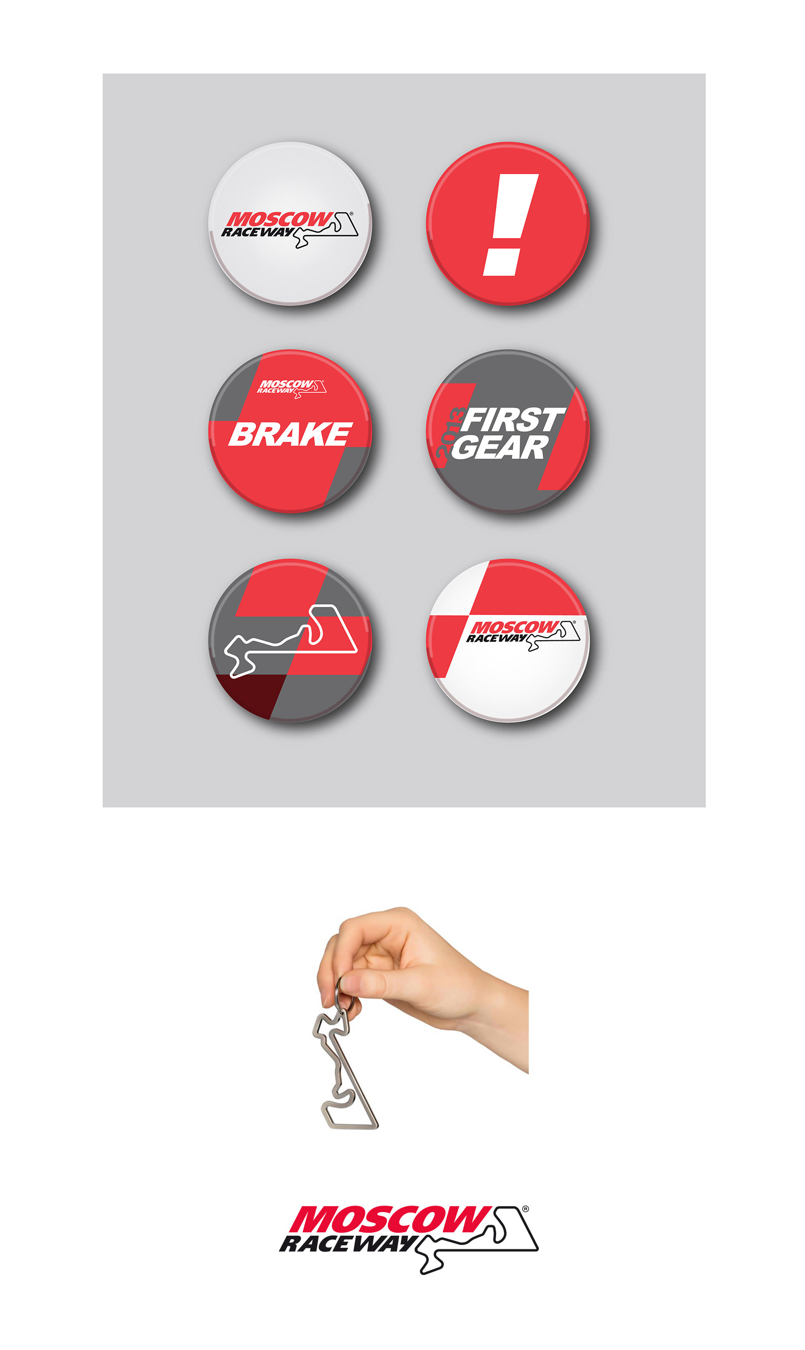
The first merchandise range covers over 20 items. and draws inspiration from actual on track signages. Playful references such as the pitstop lolipop messages and warning messages on lifting equipments are places strategically into fitting items.
Special event based items such as DTM T-shirts marked the history of the event's first visit to Russia, and we managed to keep the Moscow Raceway Identity intact by negotiating with DTM organising body, finding a balance between their own brand identity and ours.